A Space Poster Without the Rocket: How to Read Colour, Scale and Empty Space
Read a space poster without the rocket by comparing colour, scale and empty space, and see how each choice makes a distant world feel near or remote.
A space poster without the rocket can make a quiet wall feel unexpectedly deep: a blue planet hangs above a pale horizon, while most of the page is simply dark. Take a chair, choose one such image, and look at it for a few minutes before searching for a caption. The useful question is not only what the poster depicts, but how its colour, scale and empty space persuade your eye to imagine distance.
This is a small visual-reading exercise, not a test of astronomy knowledge. A poster might show a moon, a ringed planet, a star field or an imagined landscape; you need only be able to see where the image feels close and where it seems remote. Compare two posters if you have them, or compare two areas within one. The aim is to notice the choices that guide your sense of scale and separation.
What changes when colour sets the distance?
Colour often gives the first clue about depth. A bright, saturated object can seem to come forward, while a dark or muted area may recede. But that is not a rule the artist must obey. A sharp, icy-white planet against a black field can feel starkly far away, and a broad wash of warm orange may draw you into an imagined atmosphere.
Look first at the image’s largest colour areas. Is the background one even black, or does it shift through navy, violet or charcoal? Does the planet have a bright rim, a shaded edge or a hazy glow? A gradual transition can suggest a great distance of atmosphere or shadow. A crisp boundary can make the object feel cut out and nearer, even when it occupies only a small part of the page.
Then compare the colours of the object and its surroundings. If both share similar tones, the planet may blend into the scene and seem remote. If a vivid turquoise sphere sits against a nearly colourless field, the contrast gives it visual weight. That weight is not the same as physical size: it is the attention the design asks you to give.
Try looking away, then glancing back. Notice what your eye reaches first. A pale crescent, a red dust cloud or a small bright point may act as an anchor, from which the rest of the image appears to recede. If the colour contrast is strongest around a horizon, your eye may read the poster as a view across a landscape. If it is concentrated on a floating globe, the image may feel more like an object displayed in space.
How does scale turn a shape into a world?
Scale is difficult to judge when a poster removes familiar reference points. A planet by itself has no tree, building or person beside it to establish its size. The artist can still imply scale through a curved edge, a visible surface, a second object or the amount of page the planet occupies.
A large disc cropped by the edge of the poster may feel close because it seems to extend beyond the frame. A small, complete sphere surrounded by darkness can feel distant, even if its details are sharply drawn. Neither approach tells you the object’s actual dimensions. They create different viewing positions: one puts you beside an immense surface; the other asks you to look across a broad void.
Look for internal details that act as unofficial measuring marks. A narrow band of cloud, a line of craters or a fine ring can make a large body feel tangible. If the details are visible only as texture, the object may read as a remote orb. If every ridge is distinct, it can feel close enough to touch. In an imagined world, those marks do not have to match a real planet; they simply help the eye decide how to approach the image.
Now compare the apparent size of objects in the same poster. A tiny moon beside a broad planet can clarify a relationship, while a star of similar size might make the composition feel deliberately unreal. You do not need to identify what the artist intended. Ask instead whether the contrast makes the scene feel monumental, intimate or oddly suspended between the two.
What does empty space ask you to imagine?
Negative space is the area the poster leaves open around its main forms. In a space image, it may be a dark field, a pale blank sky or a broad stretch between a planet and the edge of the page. It can suggest distance, but it also controls pace. A crowded arrangement makes your eye move quickly between objects; a sparse one gives each shape room to linger.
Notice where the emptiness sits. A planet pressed close to the top edge may leave a wide, vacant lower half, making the composition feel weighted or expectant. A tiny moon placed near the centre, with space all around it, may seem isolated. If open space lies between two bodies, it can become the most expressive part of the scene: a separation you can feel, though nothing is drawn there.
Empty space is not automatically calm. A wide black field can feel peaceful when the objects are balanced and softly lit. The same darkness can feel uneasy if a single bright point sits far from everything else. Ask what the vacant area does to your attention: does it invite you to look outward, hold your gaze in one place or wonder what remains unseen?
Also check whether the poster’s blank areas are truly uniform. A faint gradient, scattered specks or a barely visible glow can make open space feel inhabited without filling it. If the background is almost featureless, the image may emphasise solitude or scale instead. Those are different emotional readings produced with very little visual material.
Which reading approach suits the poster you have?
There are three useful ways to compare space posters. Choose the one that matches what is puzzling you; there is no need to complete every pass each time. If you are viewing posters with someone else, compare notes before explaining what you think the artist meant. A difference in response is part of the exercise.
- Colour-first reading: Follow the strongest contrast, then notice which areas fade or blend. This suits a poster with dramatic light, haze or a limited palette, and helps you see how mood and apparent distance work together.
- Scale-first reading: Compare the planet’s outline, visible details and any nearby objects. This suits a poster with a giant cropped world, a moon or other clear forms whose relative sizes invite a closer look.
- Space-first reading: Track the empty areas and where the main shapes sit within them. This suits a sparse poster, especially one with a lone planet or a small point of light, where placement carries much of the feeling.
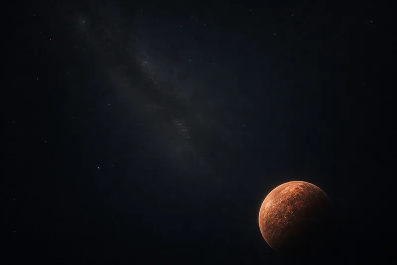
Say you have a poster with a small copper-coloured planet near the lower corner and a broad charcoal field above it. On a colour-first pass, you might notice how the warm planet stands out against the cool background. On a scale-first pass, the lack of nearby objects leaves its size uncertain. On a space-first pass, the empty upper area may make the world feel lonely or give it room to drift. Each observation comes from a different feature, so none needs to cancel the others.
To choose one approach, ask what the poster makes hard to read. If the object seems to glow but not belong to its surroundings, start with colour. If you cannot decide whether it feels close or distant, start with scale. If the image seems emotionally quiet, tense or isolated but you cannot say why, examine the empty space. That choice gives your attention a direction without turning the exercise into a hunt for one correct answer.
What should you ask while comparing posters?
Can colour alone make a planet feel distant?
It can suggest distance, especially when the colours grow muted or merge into the background. But contrast, edges and placement also shape the effect, so treat colour as one clue rather than a verdict.
Does a larger planet always seem closer?
No. A large, complete disc can appear far away if it sits within a broad field, while a cropped curve can feel near. Look at framing and detail as well as apparent size.
Why can an empty area feel uneasy?
Open space can isolate a small object or leave a gap that your eye keeps returning to. Its effect depends on where the forms sit and how strongly they stand out from the background.
Should I know the astronomy behind the poster?
Not for this reading exercise. Identifying a real planet can add context, but you can still compare visual distance and mood without naming the object.
When is it better to stop analysing?
There is little value in counting every star, identifying every shade or trying to decode a single hidden message. Those tasks can pull attention away from the poster’s broad visual choices. If you find yourself inventing rules that the image does not support, return to what is plainly visible: where the strongest colour sits, which shape dominates and how much room surrounds it.
A useful final pass is to describe the poster in one plain sentence without naming a feeling: for example, “A bright crescent sits above a dark, open field.” Then add the feeling you got from it and identify the visual choice that may have helped create that response. This keeps the reading grounded while leaving room for different interpretations.
Next time you see a space poster without the rocket, give the colour, scale and empty space separate moments of attention. The image may feel less like a view of a distant object and more like a carefully arranged invitation to look from somewhere. That shift is the pleasure of reading the poster: the world stays on the wall, but your imagined distance from it can change.